Simplified mobile version
For full information about our projects please view on desktop

Tagsmart

Defining the user experience and shaping a brand identity for Tagsmart, a highly secure art trading platform.

User research | Site mapping | Information architecture
User journey diagrams | Wireframes | Visual identity
User interface style guide

Overview

Tagsmart is a start-up working to raise the level of trust in art transactions. Their online platform offers cataloging, certification, and a marketplace for artists, collectors, and galleries. 

They needed to transform their overly complex platform. We did a comprehensive product review and redefined the user experience by taking into account all of its aspects from content and information architecture, to brand identity and UI. 

Group 87 Created with Sketch. Work in progress
implementation of the new user experience and brand identity is currently taking place.

Designing a clear onboarding

Starting with interviewing the Tagsmart team, we learned that the most pressing issue was the difficulty to onboard new users.

Conducting user research focused on the onboarding process, we’ve identified 2 key stages where users were struggling to proceed and likely to drop out. 
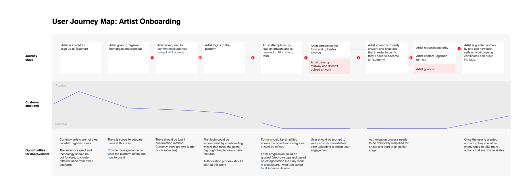
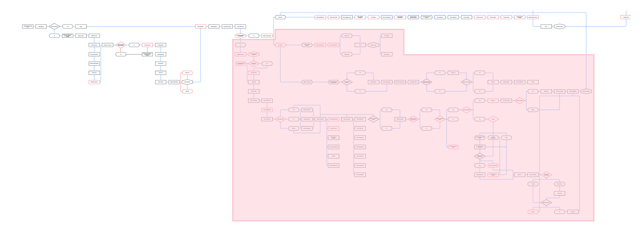
A journey map summarising the user research findings
Mapping the current user flow helped us to get a granular view of the problem

After the first login, the journey split into two tangents asking for the user’s personal data and proof of identification through the actions ‘propose new artist’, and ‘request authority’.

These tangents represent the pain points mentioned in the interviews, that were preventing users from uploading their first artwork by being obtuse in meaning and clumsily implemented.

THE SOLUTION: PUTTING THINGS IN CONTEXT

The new onboarding journey incorporates these essential actions in a way that makes sense to the user through proper contextualization.

For example: instead of asking artists to ‘propose’ themselves, we do a simple identity verification. Once verified, we can automatically grant them authority and add them to the register.

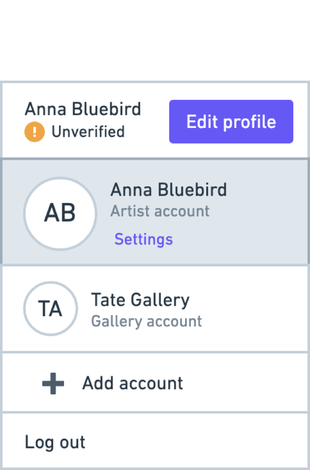
USER MENU ARCHITECTURE

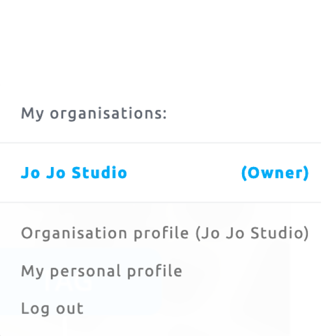
Tagsmart users can have multiple accounts. 
We’ve re-organized the accounts hierarchy structure, cleaning up obscure back-end terminology that was illegible to users. 
Dashboard Tabs

From the main dashboard, users can access unique features to help manage their artwork collection.

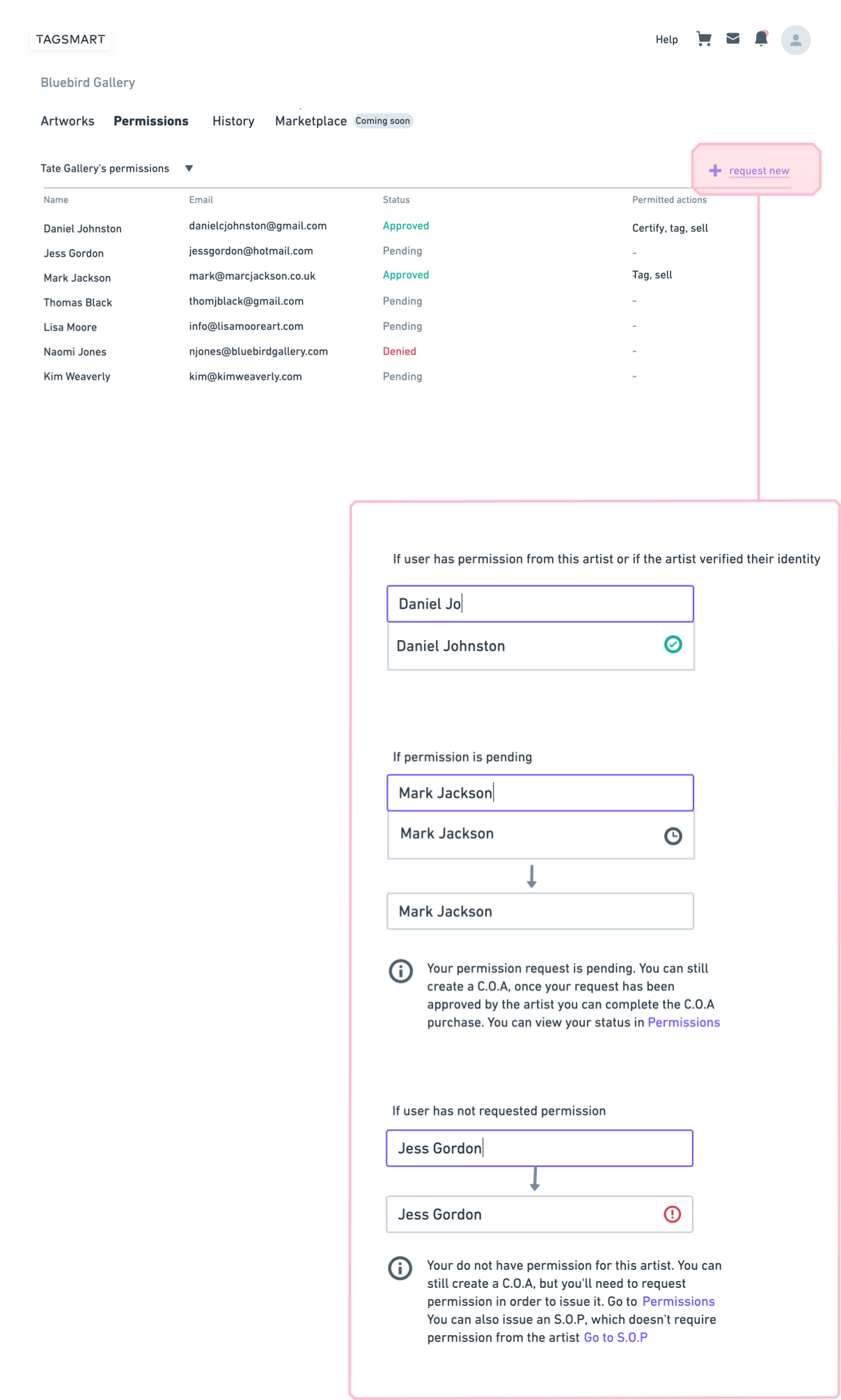
Permissions tab

This is where users can ask for permission to perform tasks on behalf of someone else. A traffic light system indicates the status of the requests.
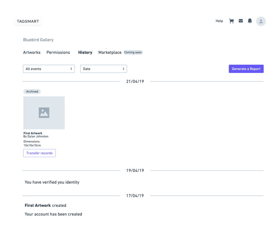
History tab

The history tab is a mini-archive that makes it easy to trace valuable transactions 
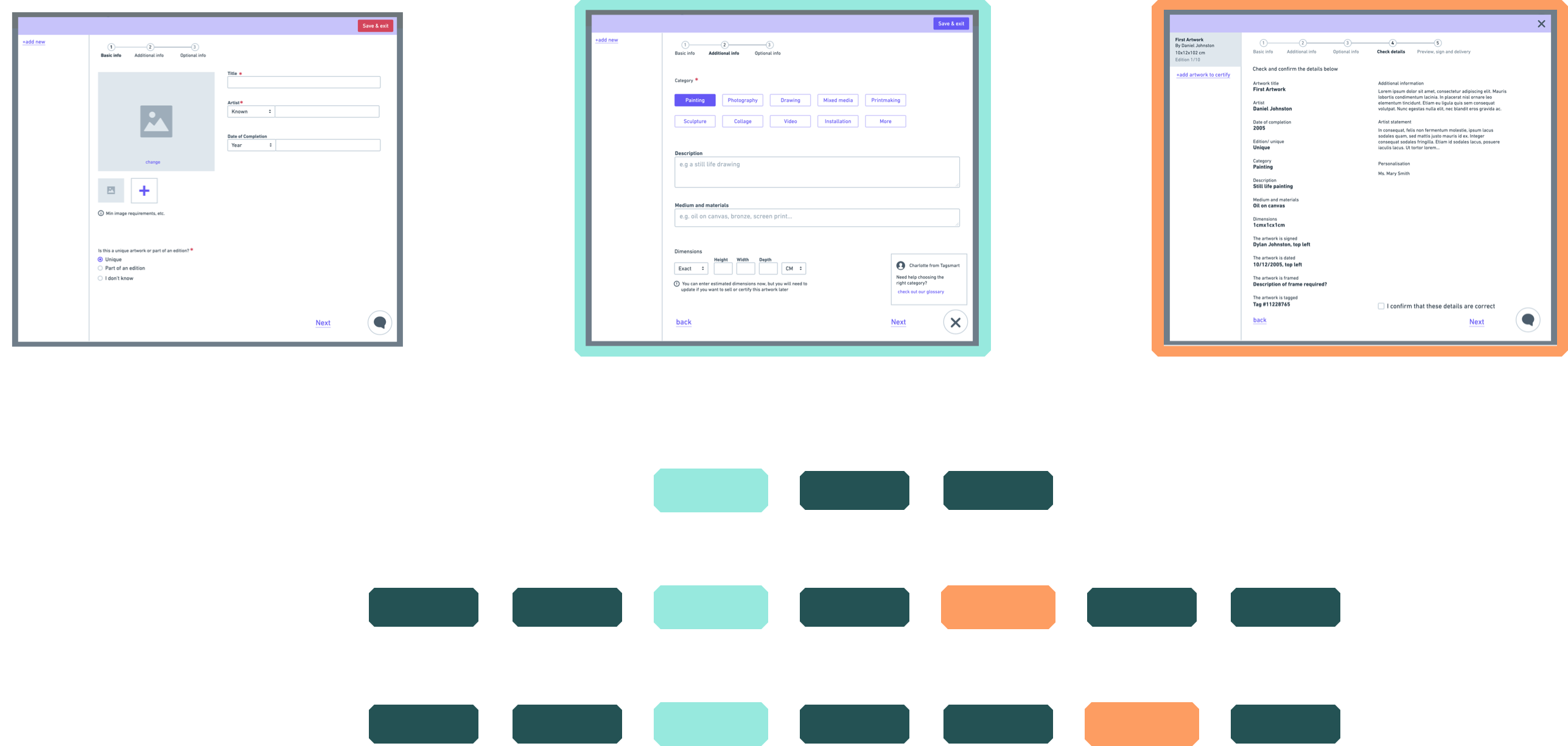
CORE FEATURES: UPLOAD, CERTIFY, SELL

Analysing the requirements of the core journey and identifying repeating data fields, to design reusable content modules. 
Rebranding Trust

Although the need for rebranding was clear, the team was worried that a new branding will mean losing recognition within their existing customers. 

We’ve interviewed users, asking them to describe Tagsmart in broad lines. What seemed to have gotten stuck in their memory was the company’s name and physical products, rather than any visual assets.

This was evidence that Tagsmart’s generic brand wasn’t doing anything to help their positioning. They now felt confident to go ahead with a fresh brand that represents their values.

Logotype Design
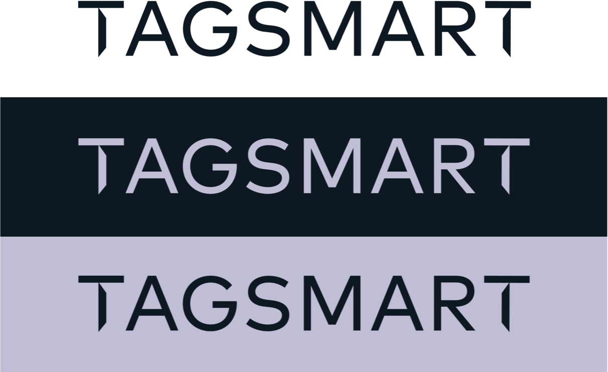
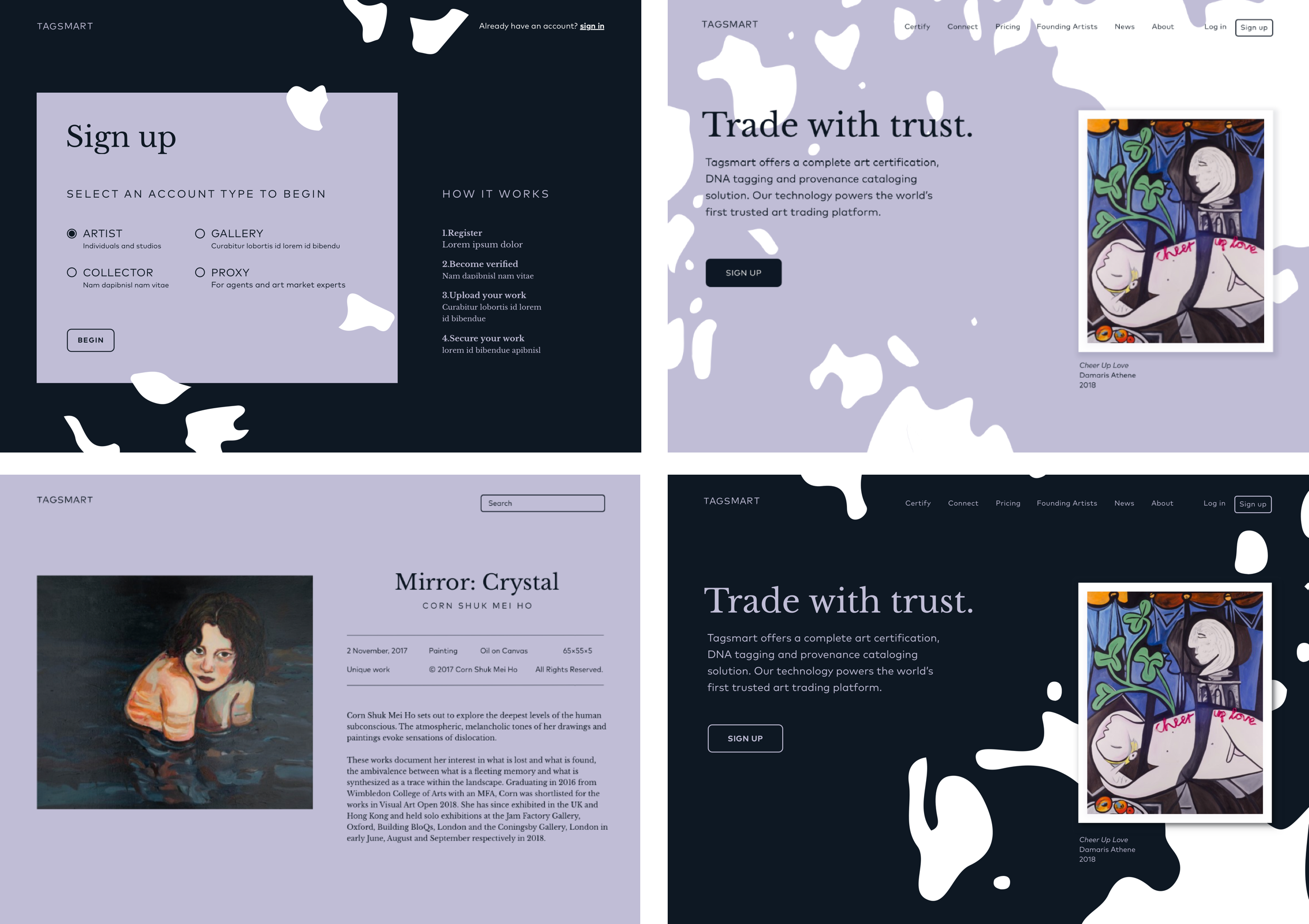
The new colour palette is based upon business values and usability principles.

Previously, Tagsmart had a bright pink as their main brand colour. This colour is problematic in UI context as it’s similar to red but can’t quite replace it. 

UI Foundations

A design kit outlining core design principles, for future designers and front-end developers to build upon.
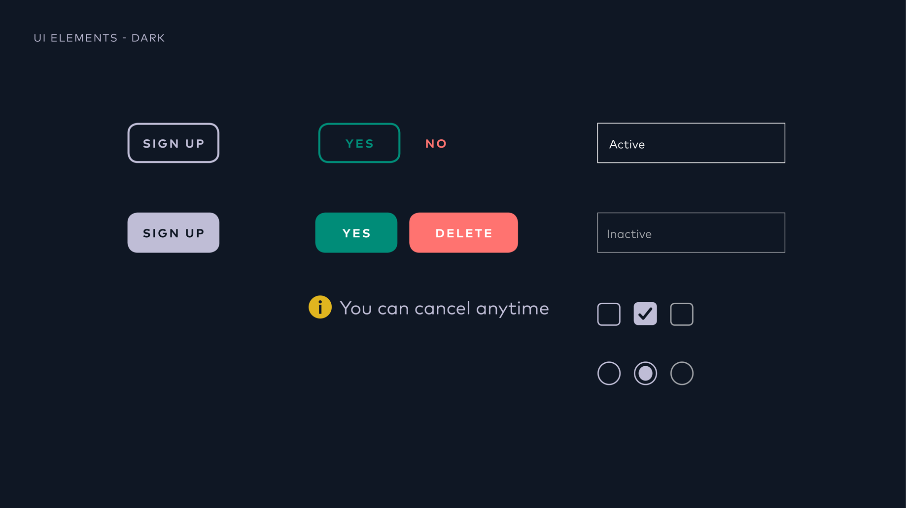
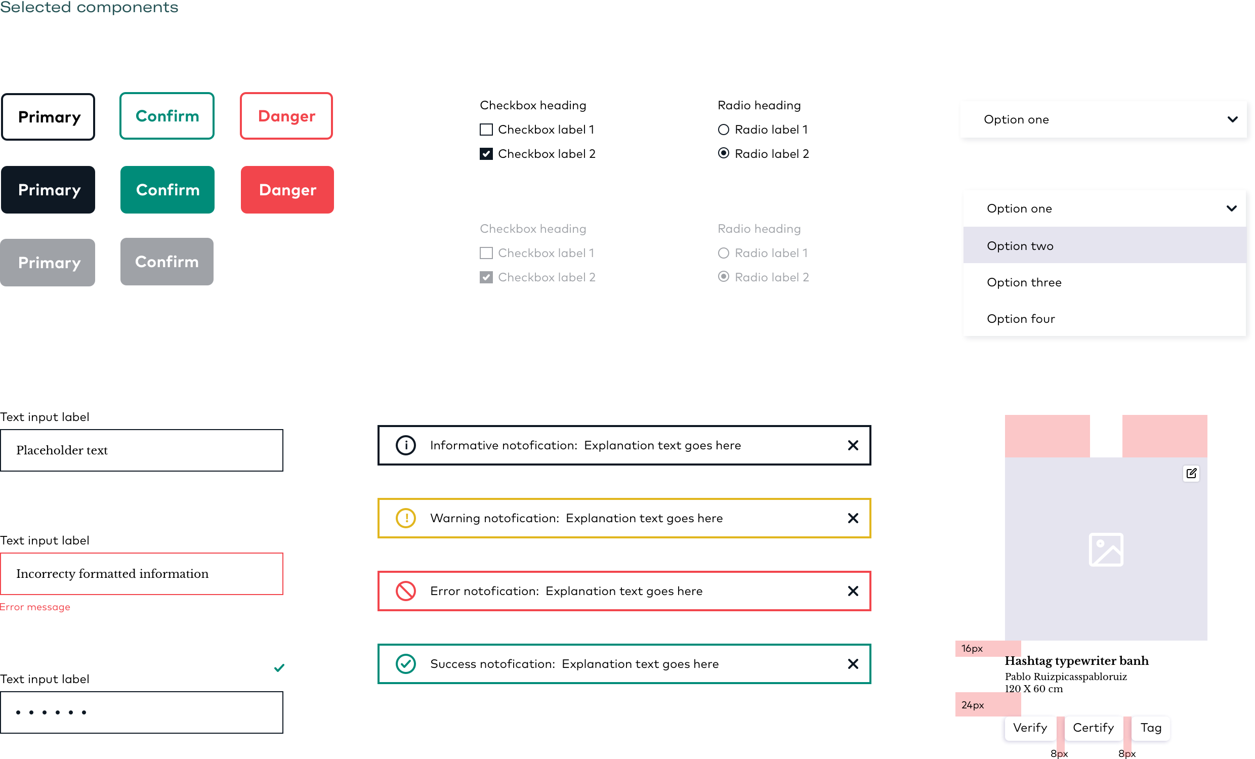
UNIQUE VISUAL ASSETS

We created a process that converts artworks into graphic patterns, as a way to both feature original work by Tagsmart artists’ and produce original branding assets for Tagsmart.

Overview

Tagsmart is a start up working to raise the level of trust in art transactions.Their online platform offers cataloguing, certification, and a marketplace for artists, collectors and galleries.

They needed to transform their overly complex platfrom. We did a comprehensive product review and redefined the user experience by taking into account all of its aspects from content and information architecture,
to brand identity and UI.

Group 87 Created with Sketch. Work in progress
implementation of the new user experience and brand identity is currently taking place.

Designing a clear onboarding

Dashboard Tabs

Logotype design

UI FOUNDATIONS

UNIQUE VISUAL ASSETS

Stowga

Relaunching the Stowga warehousing marketplace. Improving experiences across the site, expanding the brand and designing an adaptive UI system.

Usability review | Web and mobile wireframes | Web and mobile
visual design | brand expansion | user interface style guide

OVERVIEW

The Stowga marketplace turns the lengthy offline process of renting warehouse space into a quick and easy interaction. 

The marketplace site needed to put forward its key principles of simplicity and transparency, ensuring a wide range of audiences could interact and make deals with ease.

To achieve that, Stowga’s basic brand needed to be expanded into a comprehensive UI system.

VISUAL BUILDING BLOCKS

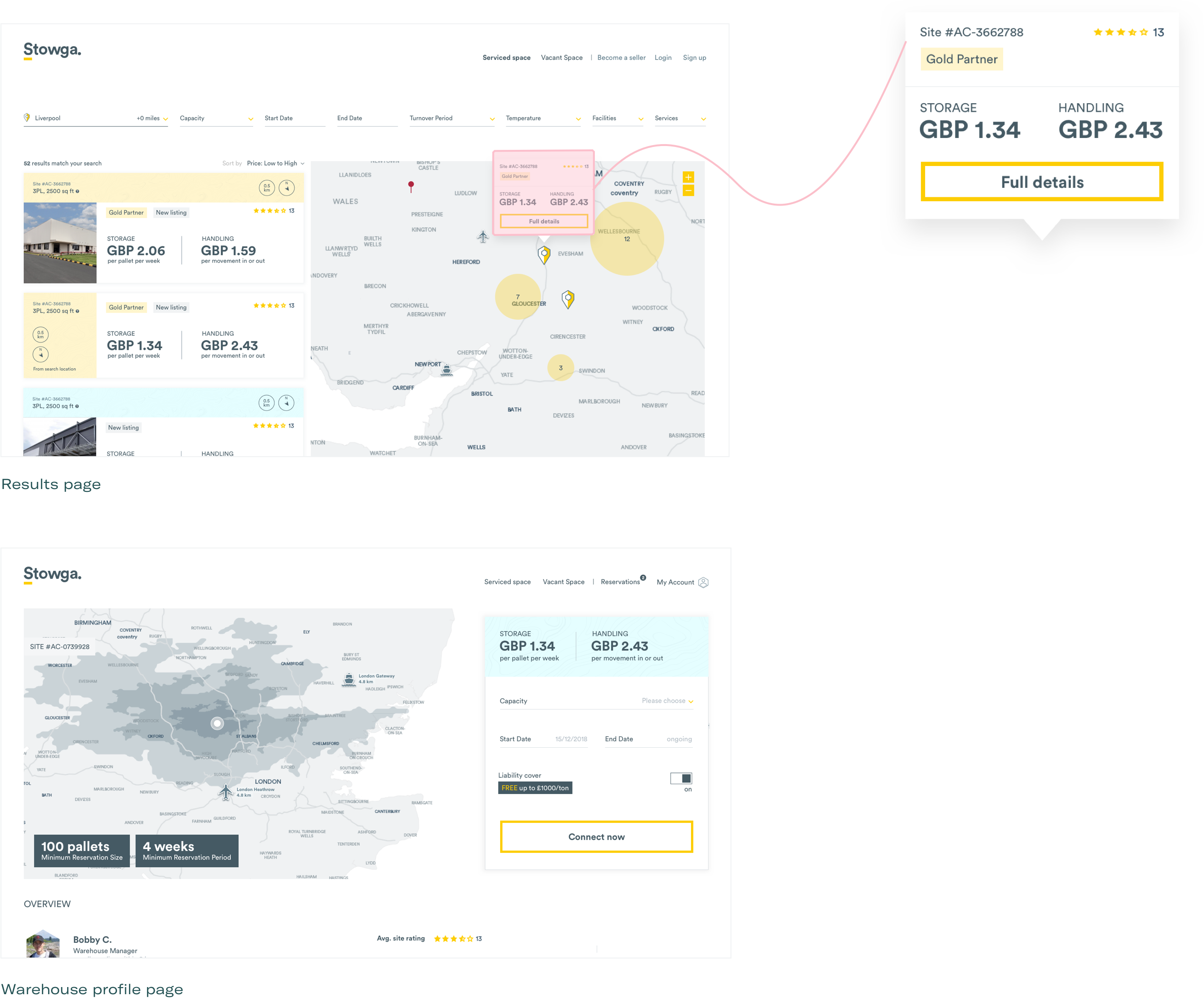
To build the Stowga UI system, we started with the main area of the marketplace where customers can search and browse warehouses. The most basic unit on this page is the pricing information, as this is the first thing customers look for.

Next are the other elements that make up the warehouse listing item. 

A listing item is a modular unit. The white area is for primary info, and the colour area is for secondary information. This colour-based division is adaptable and allows size and positioning to change while maintaining consistency. 

Additional basic elements

The basic building blocks adapt to create new components across different pages

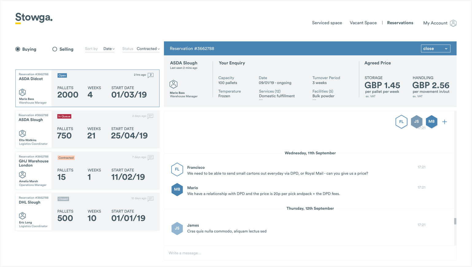
The reservation area has a similar layout to the search page but is more complex. The basic units adapt to accommodate different information while maintaining the same visual hierarchy.

The secondary colour palette for reservation status

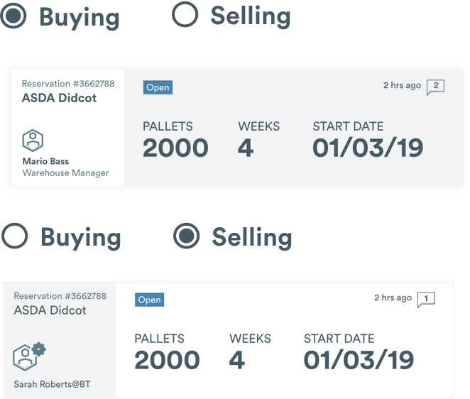
Customers can have reservations for both buying and selling space. The flipped colours provide a quick visual cue to which you are currently viewing.

BESPOKE MAP EXPERIENCE

Stowga knew from the start that they wanted a bespoke map. Location and local information are key factors for choosing a warehouse, so the map has to provide access to this information. 

Building on the newly established principles of spaciousness and simplicity, we created a new ‘inverted map’. 

The white sea ensures that the map stands out on the page, without using harsh means like bold outlines or huge fonts.

We kept going back to the research to make sure the right information stands out, while unnecessary data is hidden.

The Dark Side

Once the buyer side of the marketplace was done, we moved on to design the seller area. 

This is the ‘serious’ side of the platform. Here users can put their warehouse space on offer, manage their listing and pricing. There are many details and complex features. 

We used the somber Stowga blue, creating a clear distinction between the buyer and seller modes. The adaptive UI system allowed us to easily adapt components and maintain consistency. 

Overview

Stowga marketplace turns the lengthy offline process of hiring a warehouse into a quick and easy interaction.

The marketplace site needed to put forward its key principles of simplicity and transparency, ensuring a wide range of audiences could interact and make deals with ease.

To achieve that, Stowga’s basic brand needed to be expanded into a comprehensive UI system.

visual building blocks

BESPOKE MAP EXPERIENCE

THE DARK SIDE

CognitionX

CognitionX is a platform that tracks AI-related data. We designed the platform’s MVP from concept to launch.

User research | User journeys | Wireframes | Brand refresh
Visual design | User interface style guide

OVERVIEW

CognitionX had a basic brand – icon, logotype, and four colours. They have conducted some user research and defined the core requirements for the MVP.

Our brief was to design the core user journeys, establish a visual foundation, and wireframe and design the main platform areas.

to expand THE BRAND VISUAL IDENTITY,
We started by enhancing the existing assets

Logo evolution: creating a more organic shape by using assymetrical lines, and increasing legibility by reducing the size of the colour spots. 

And developing new core assets

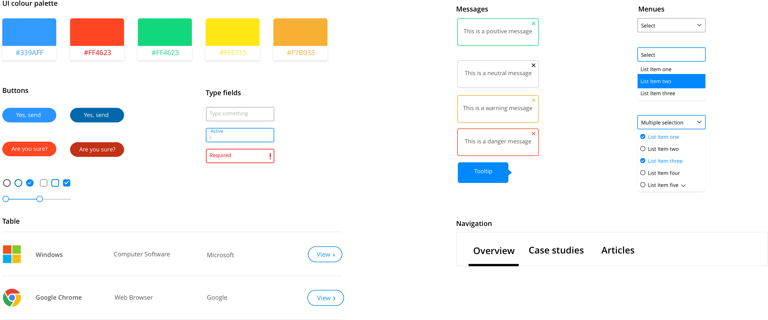
We then proceeded to create a UI style guide. Because it’s an MVP, we made it lean. Being selective about which components to design, allowed us to focus on getting the basic principles right. A precise style guide can go a long way to save time down the road.

modular item pages

The CognitionX database includes thousands of items. They are divided into types such as products, organisations, and news. 

Each item on CognitionX has its own Item Page.
The item pages are the core of the platform. 

Different item types have different kinds of data. For example, an organisation page can display a video and a news page has links to related articles.

So how do we design an item page that works for all item types?

Instead of designing a unique page for each item type, we created a system of building blocks. Most item types have some common data sets, so first we identified those. Then we established a set of principles such as font sizes, spacing, and positioning. 

This system ensures consistency and makes it easier for users to locate relevant information. 

encouraging exploration

The next thing to think about was how we can encourage exploration on the platform. CognitionX offers a uniquely deep search experience, and we don’t want users to miss out on that.

Interesting outcome of rich data is that it’s possible to find endless connections between items. Making these connections visible can provide a much more engaging experience. 

By utilizing the proprietary software capabilities, we can make valuable suggestions to users.
We designed UI elements that support interconnectivity, and limit the possibility of a ‘dead-end’ search. 

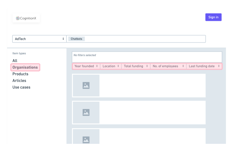
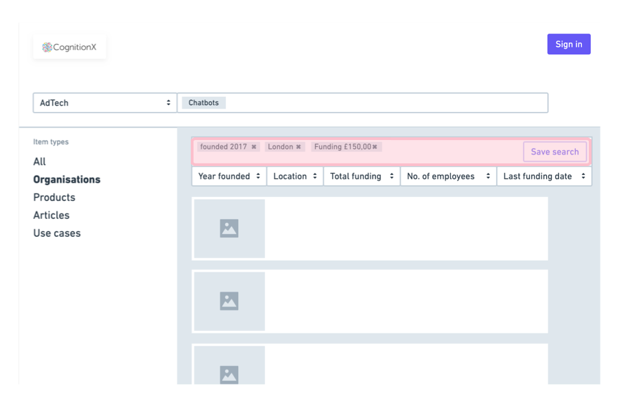
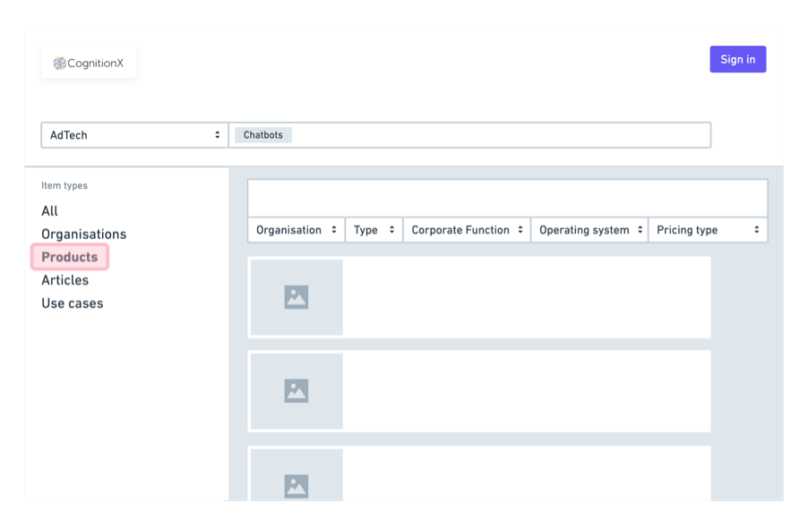
SEARCH AND FILTER RESULTS

The final MVP requirement was to lay the foundation for the search experience. The platform’s complex taxonomy presented some big challenges to designing a usable search. 

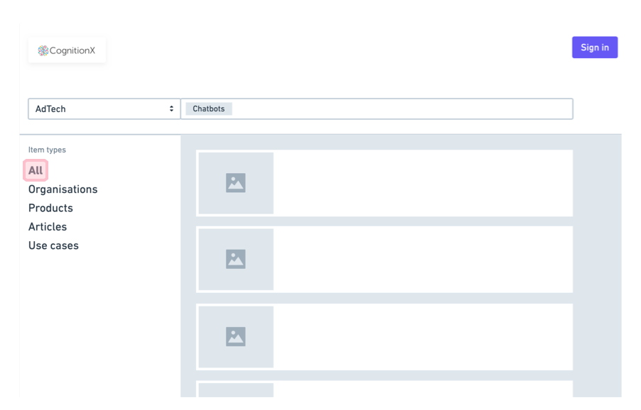
We designed a search experience that provides guidance and somewhat limits choice. This enables the user to focus and not be overwhelmed by too much data. 

1 Open search with toggle suggestions

2 ‘All’ selected by default

3 Selecting item type enables filters and each type has a unique set

4 Add or remove filters to fine-tune the results

5 Selecting another item type removes existing filters

OVERVIEW

CognitionX had a basic brand – icon, logotype and four colours. They have conducted some user research and defined the core requirements for the MVP.

Our brief was to design the core user journeys, establish visual foundation, and wireframe and design the main platform areas.

branding and ui style

modular item pages

encouraging exploration